During my time working at Asian Community AIDS Services (ACAS), I designed logos for a variety of the organization’s projects. Aside from my role as a manager and providing educational workshops, my graphic design skills came in handy in adding more legitimacy to the various projects. Most of these logos had to be completed in a very short timespan so while brainstorming and sketching remain part of my process, quick decisions were made in deducing final concepts.
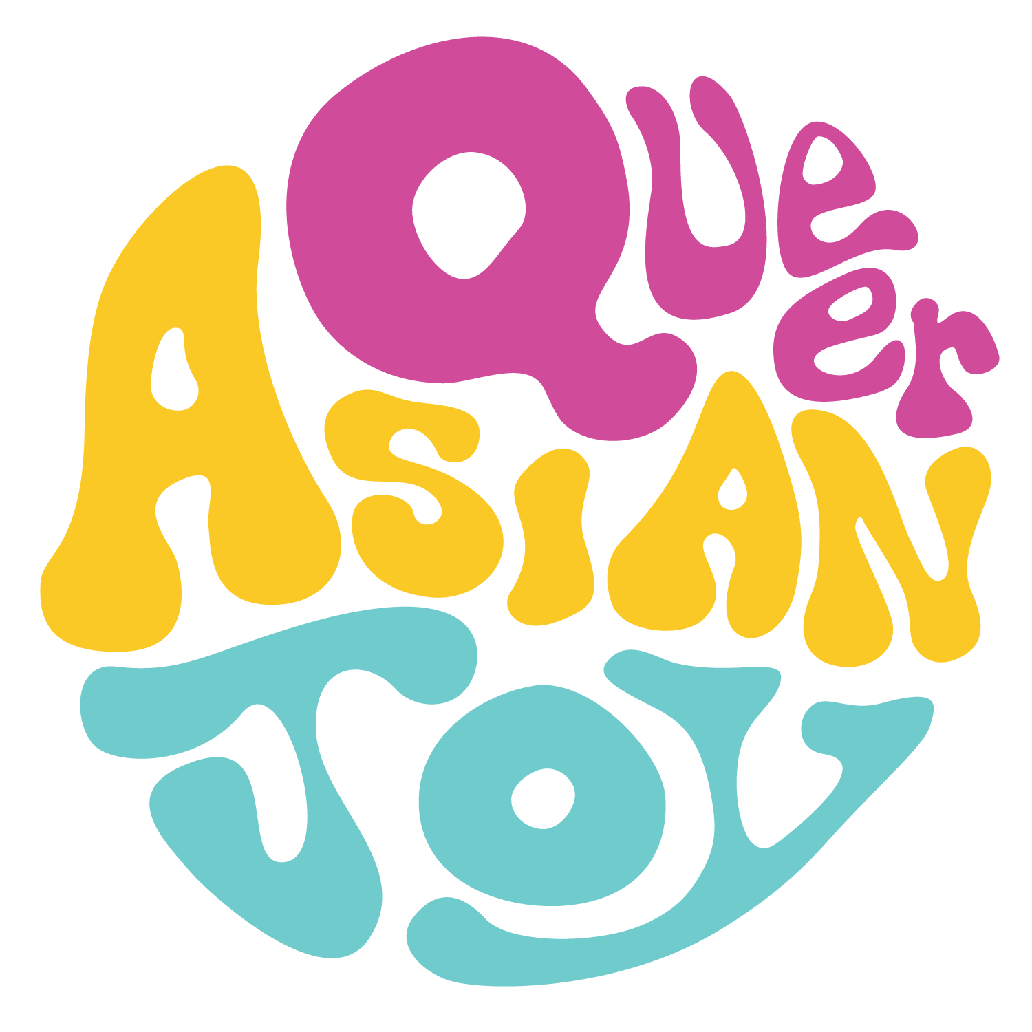
Queer Asian Joy
Queer Asian Joy was a short-term project for Asian LGBTQ folks to learn traditional fan dances from different cultures. The logo had to visually reflect joy through its colours and playful type, reminiscent 1960s’ typography. It also reflects energy and movement from dancing. I designed the logo to parallel the yin and yang symbol.
Straight Talk
Straight Talk was a research study at ACAS aimed at reaching straight-identifying men who have sex with men. As a discreet group, the confidentiality of its participants was a top priority. The logo had to be straightforward, simple, and direct to quickly reach the target population in a fast-paced environment. Business cards were used to promote and provide contact information for the study.

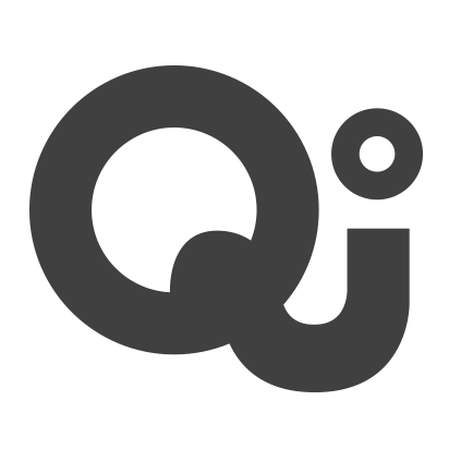
Qi zine

ACAS published a monthly newsletter in the form of a zine. They asked me to design the zine’s logo. I provided many variations before landing on the final form. The Q and i were connected to represent the goal of the zine to provide community connection. It is both soft, playful, and inviting.
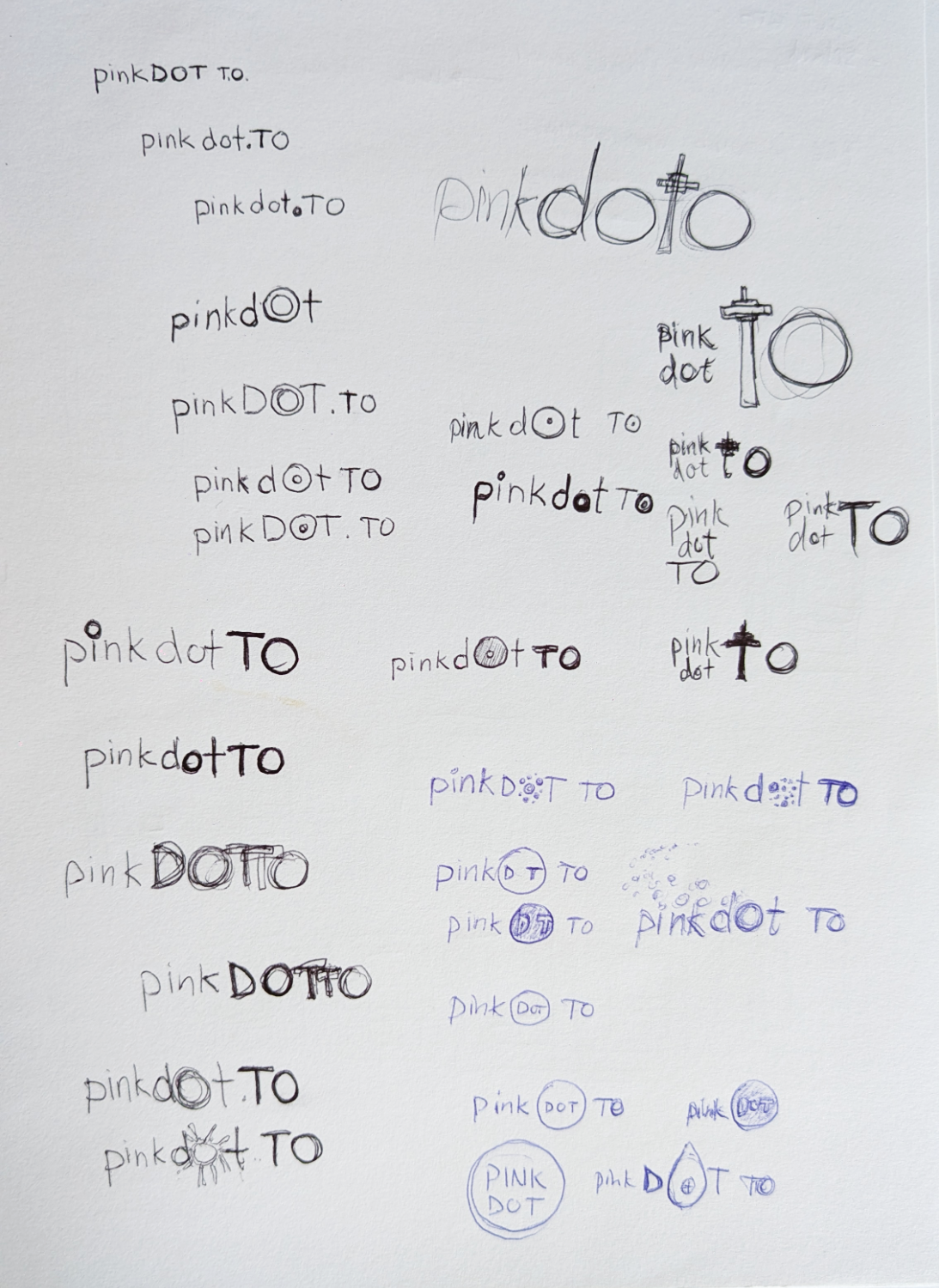
Pinkdot TO
Pinkdot is an annual event organized by ACAS, originally started in Singapore to promote same-sex marriage and LGBTQ rights. The Pinkdot Toronto logo was designed to feel connected to the original identity from Singapore while remaining unique to Toronto. The rounded sans serif typeface creates a friendly feeling. The multiple dots in the background represent the diversity that Toronto is known for while coming together to support a community.