
Wordmark Rebrand
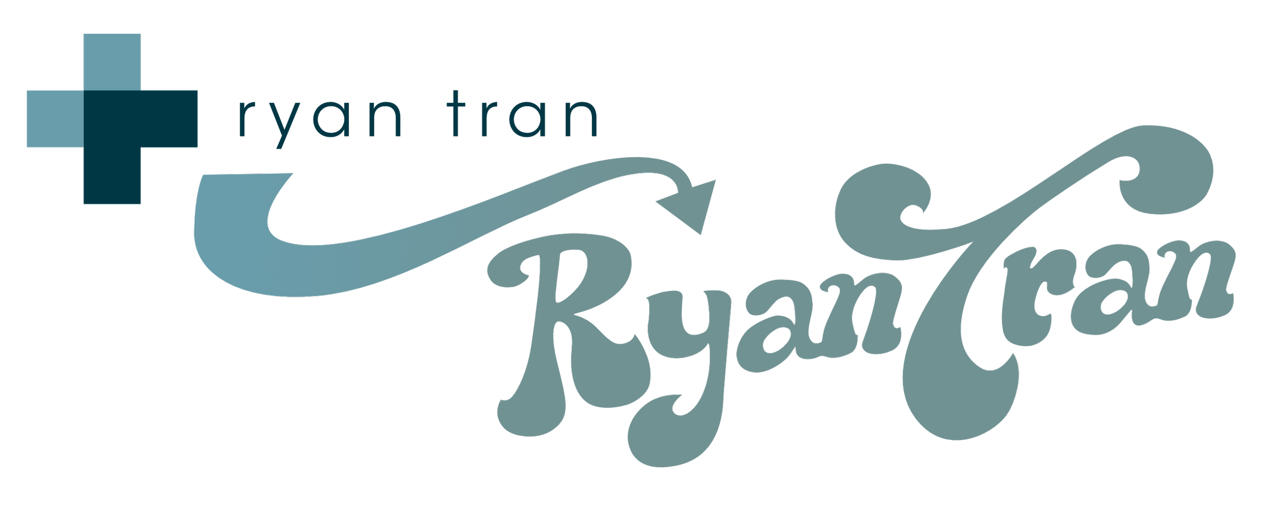
Some things are hard to let go of but some things are meant to change and reflect the times. A personal wordmark I haven’t changed since graduating, it was much overdue to rebrand to better reflect who I am now as a designer.
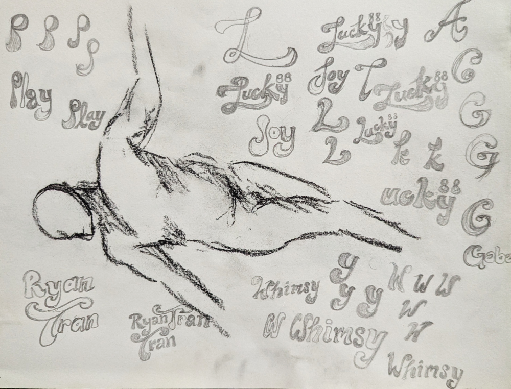
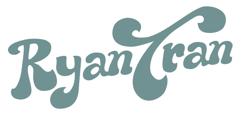
What started out as just an exercise to play around with typography became a design that made sense to apply my name to as it felt more natural to who I am as a designer. It evoked joy, flow, easygoingness, and a carefree attitude. This was a reminder of how play can be integral to the creative process. I also don’t like to waste paper so I reused old life drawing sheets to be environmentally-friendly.
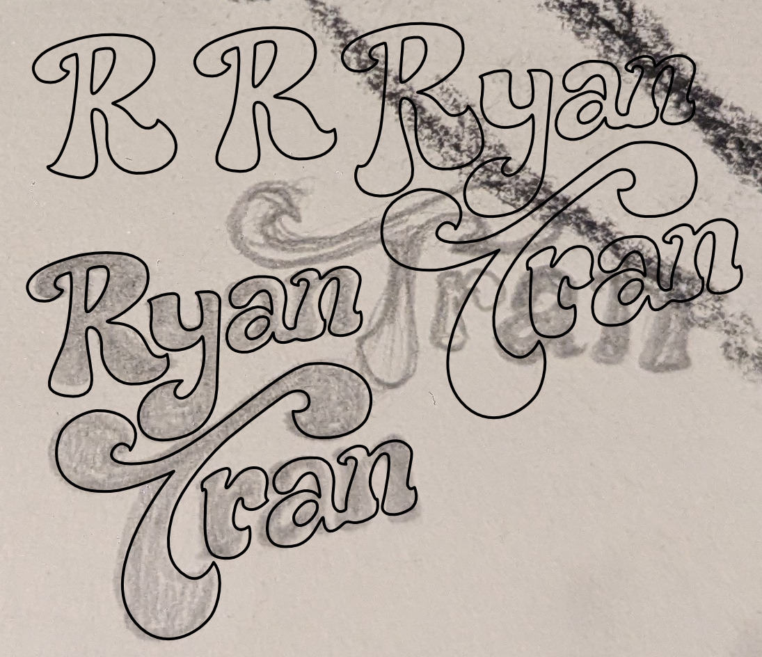
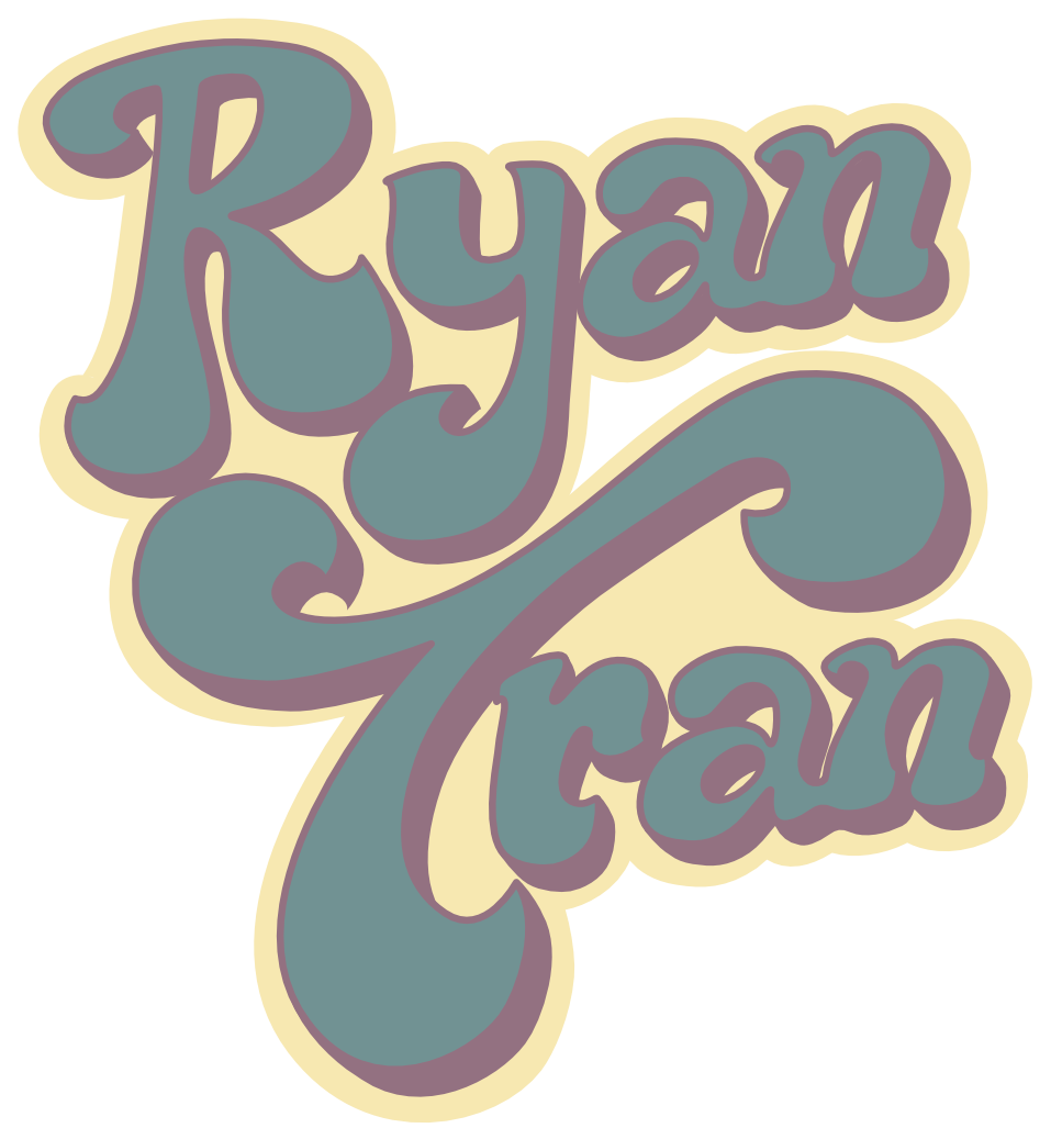
Especially in this era of AI, it is more important to emphasize the beautiful imperfections only a human touch can make to connect to its audience. Completely hand-drawn first before digitalizing and refining the details on screen. The retro 60s look is still one of my favourite nostalgic inspirations. The decorative flow also hints at the flow of water, an environment that I feel very comfortable in and naturally gravitate to.
Who am I as a designer and as a person?
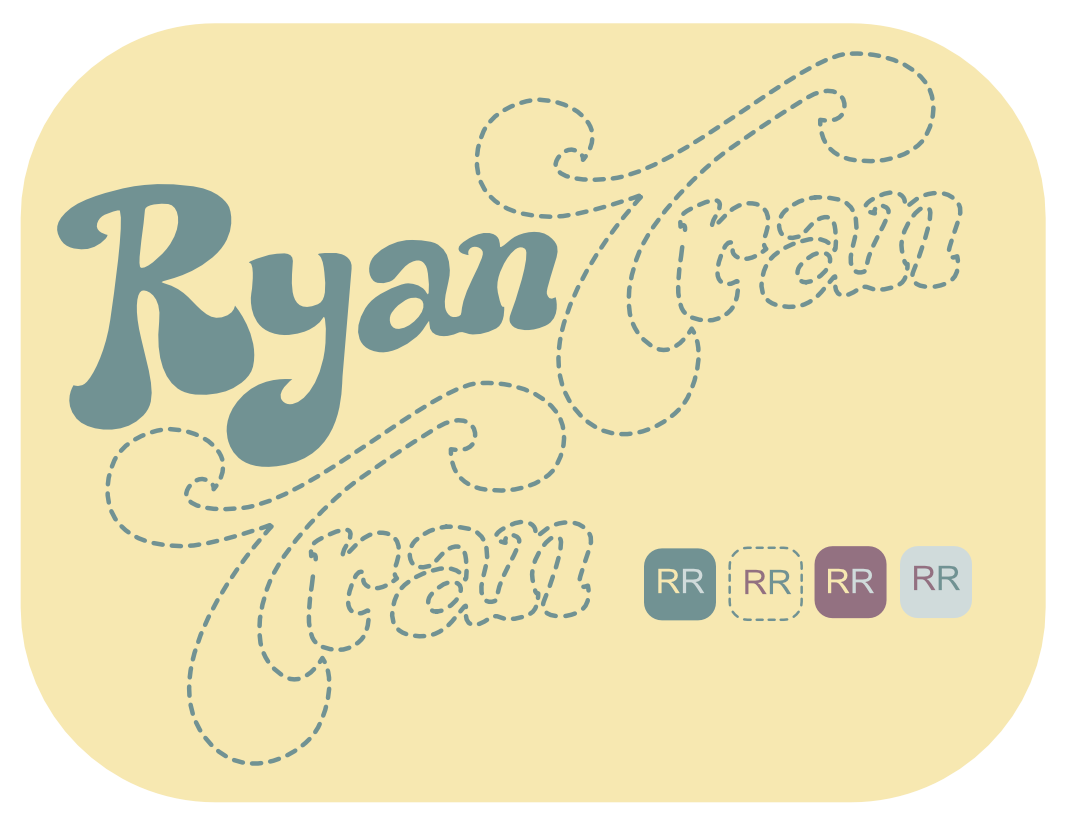
The wordmark was designed to fit neatly with both horizontal and vertical arrangements. The standardized colour scheme created a stronger brand invoking the joy and playfulness in my creativity while maintaining the calm and reliable teal colour connecting my original wordmark.