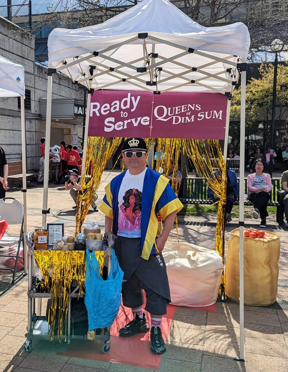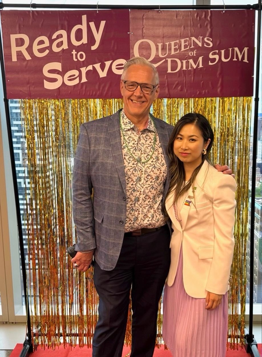
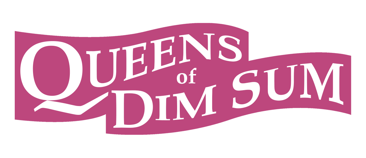
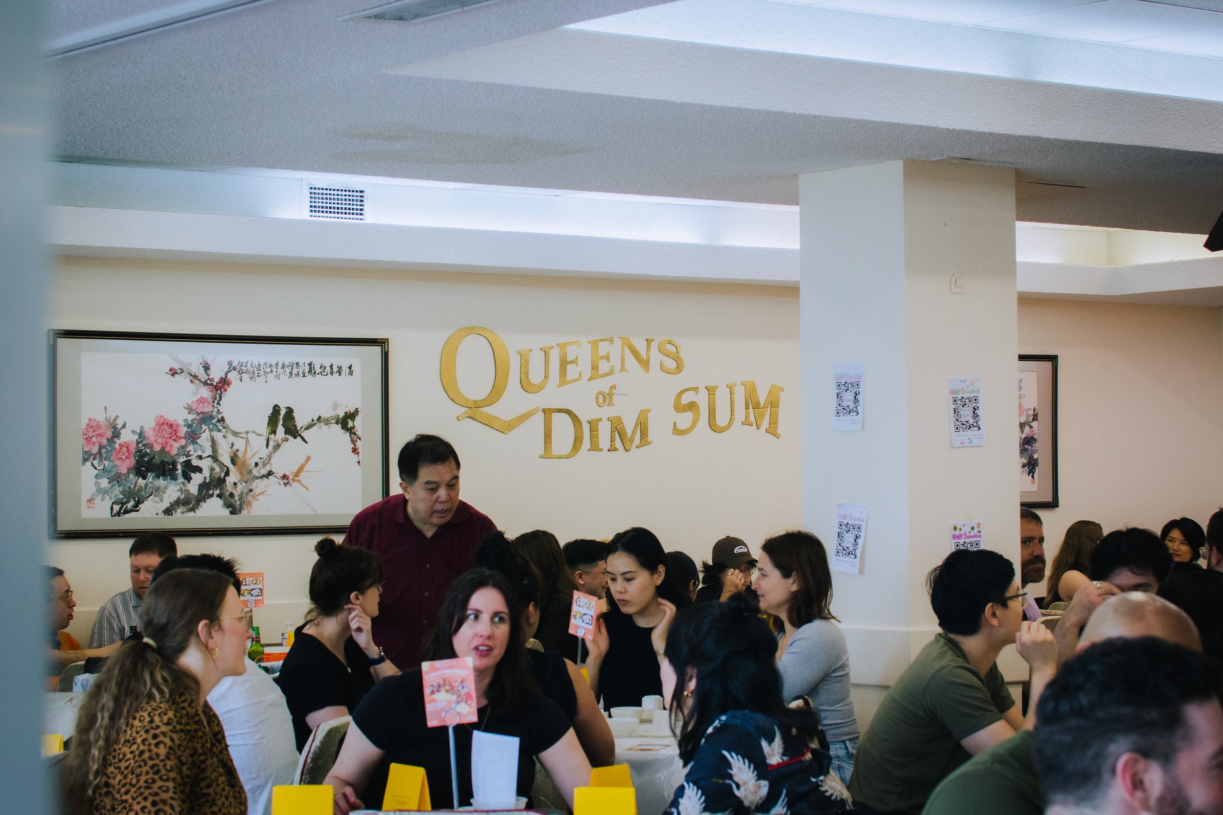
I designed the identity of Queens of Dim Sum to be timeless and be recognizable in its wavy shape. The typeface of the logo was chosen because of its classic serifs making it feel traditional and reliable as a brand. However, its wavy shape carries the playfulness of drag and the queer community. The pinkish purple colour symbolizes royalty and elegance while also being a nod to queerness. The surrounding purple emphasizes the logo when needed, but the logotype remains strong on its own without the background shape as seen in the image above. The hand cut signage is a callback to the hand cut signs that Chinese restaurants would use for special occasions.
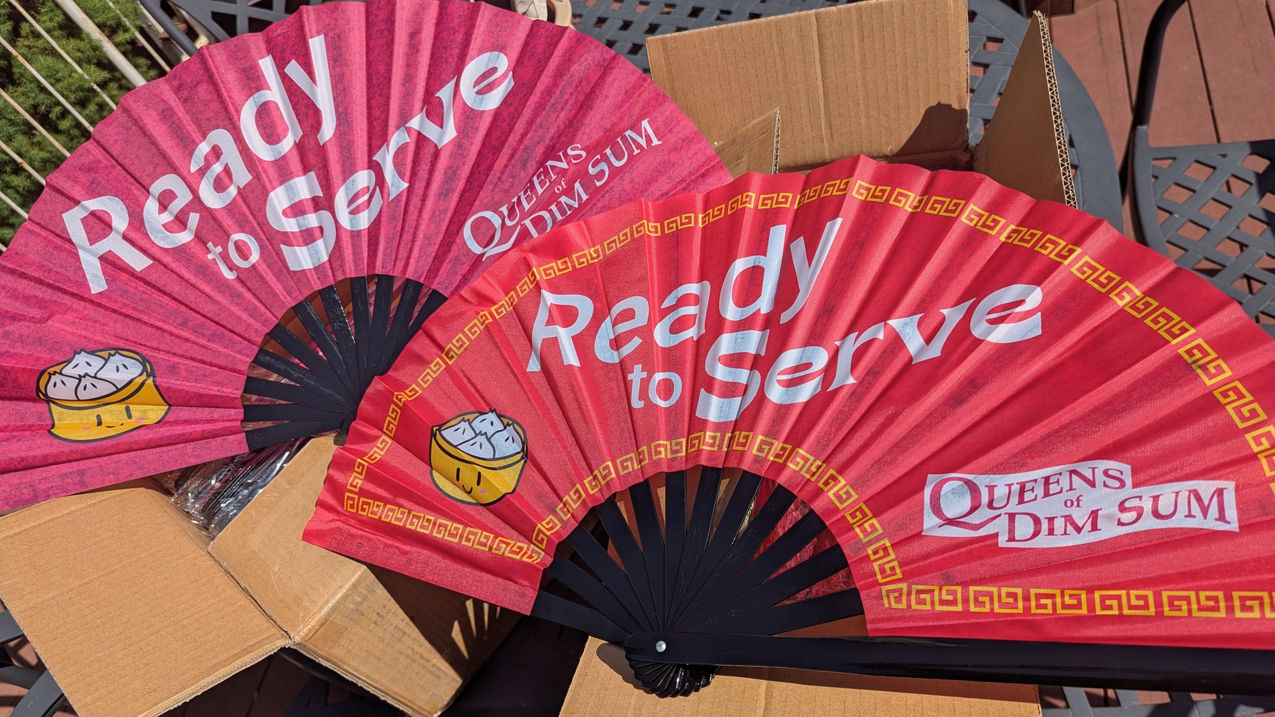
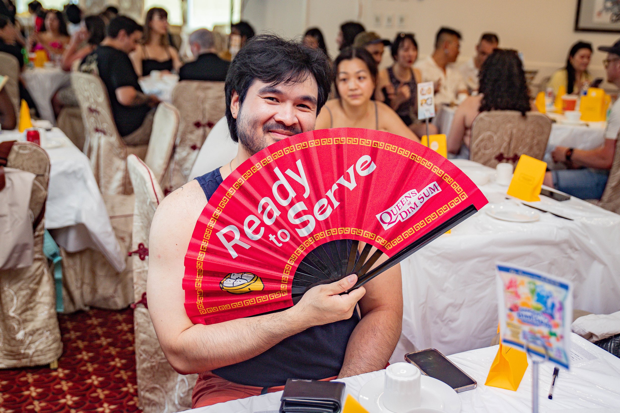
As part of our branding, fans were the perfect way to combine both Asian and LGBTQ culture for guests to take home. I designed both fans, one representing Asian culture and the other with the brand’s royal purple colour. Both designs with a subtle sparkling glitter texture of course!


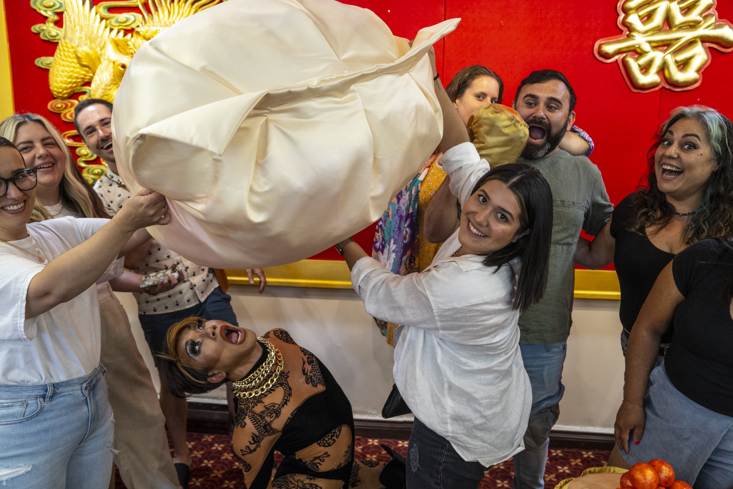

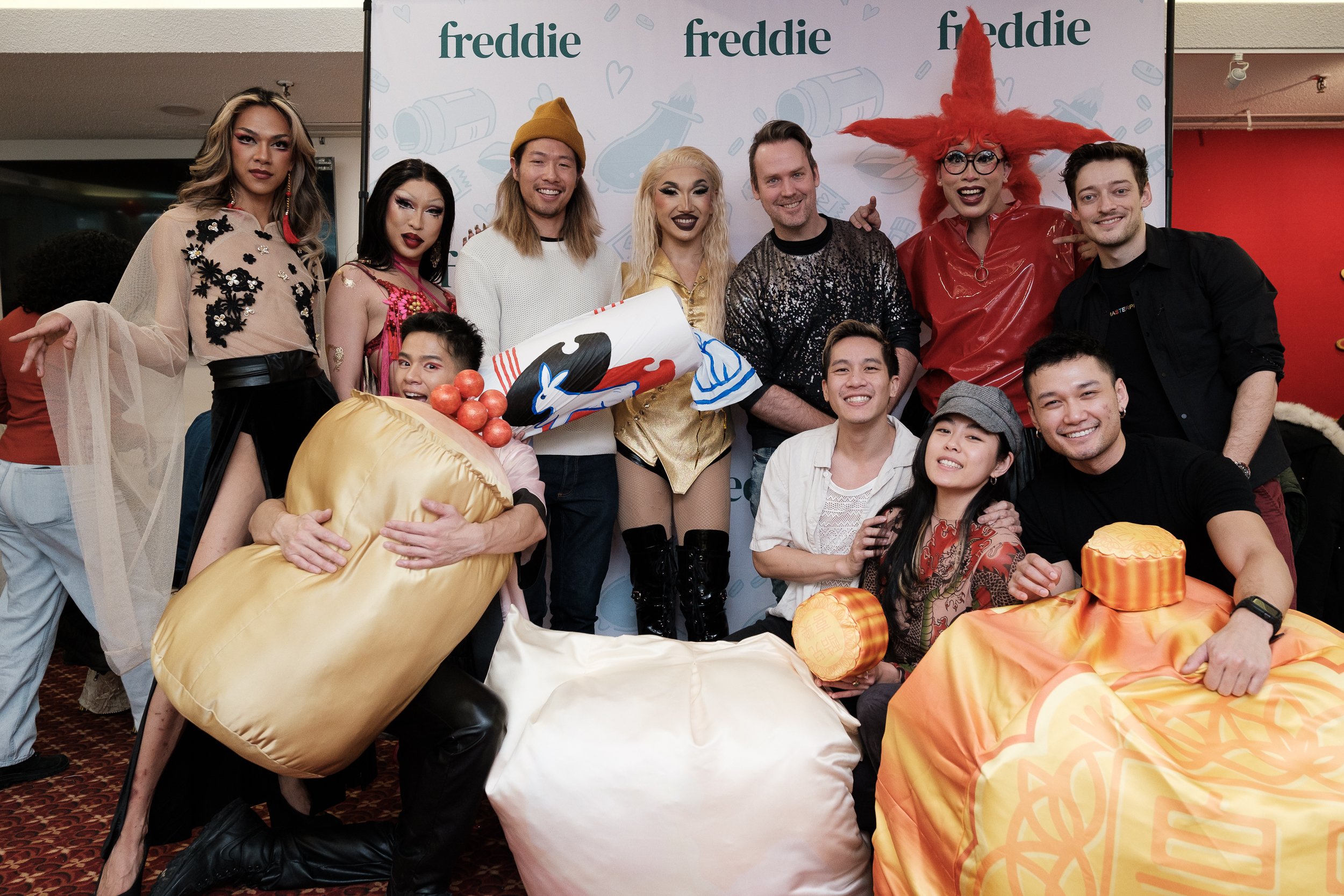
Working together with a local queer fashion designer, we conceptualized and developed large-scale dim sum plushies as a complement to our events. These giant plushies were meant to engage guests to interact and play with (or sit on!) and use as photo-ops furthering our event’s identity. I designed the prints for dye sublimation on fabric. We also launched a short-run of miniature dim sum plushies (har gow & siu mai) for merch to take home.
A common trend seen among many Asian brands, I designed cute and simple mascots or characters with a consistent look that could be used across gifts and merch. I designed buttons that were given to guests celebrating birthdays or bachelorettes.